Living through this year has been extremely different compared to years prior, it’s undoubtedly something none of us have ever experienced before. You could say that the 2020 Pantone colour of ‘Classic Blue’ unfortunately matched the overall blue mood of the year rather than anything else that could’ve been positive.
Next year is hoping to bring with it a new sense of hope and dependability and so it was two colours chosen for 2021. Firstly, the Illuminating Yellow (13-0647 TCX) is meant to represent the light at the end of the tunnel – “a warming yellow shade imbued with solar power” (Pantone). The second colour is Ultimate Grey (17-5104 TCX) which represents “solid and dependable elements which are everlasting and provide a firm foundation” (Pantone). The combination of the two Pantone colours expresses a notion of strength and hopefulness that is seen as both enduring and uplifting, which is just what many of us are after for the year ahead.
Here are 5 hand-picked wallpapers chosen by Luxe Walls, that all somewhat share the new Pantone colour scheme and therefore the positive vibes attached also.
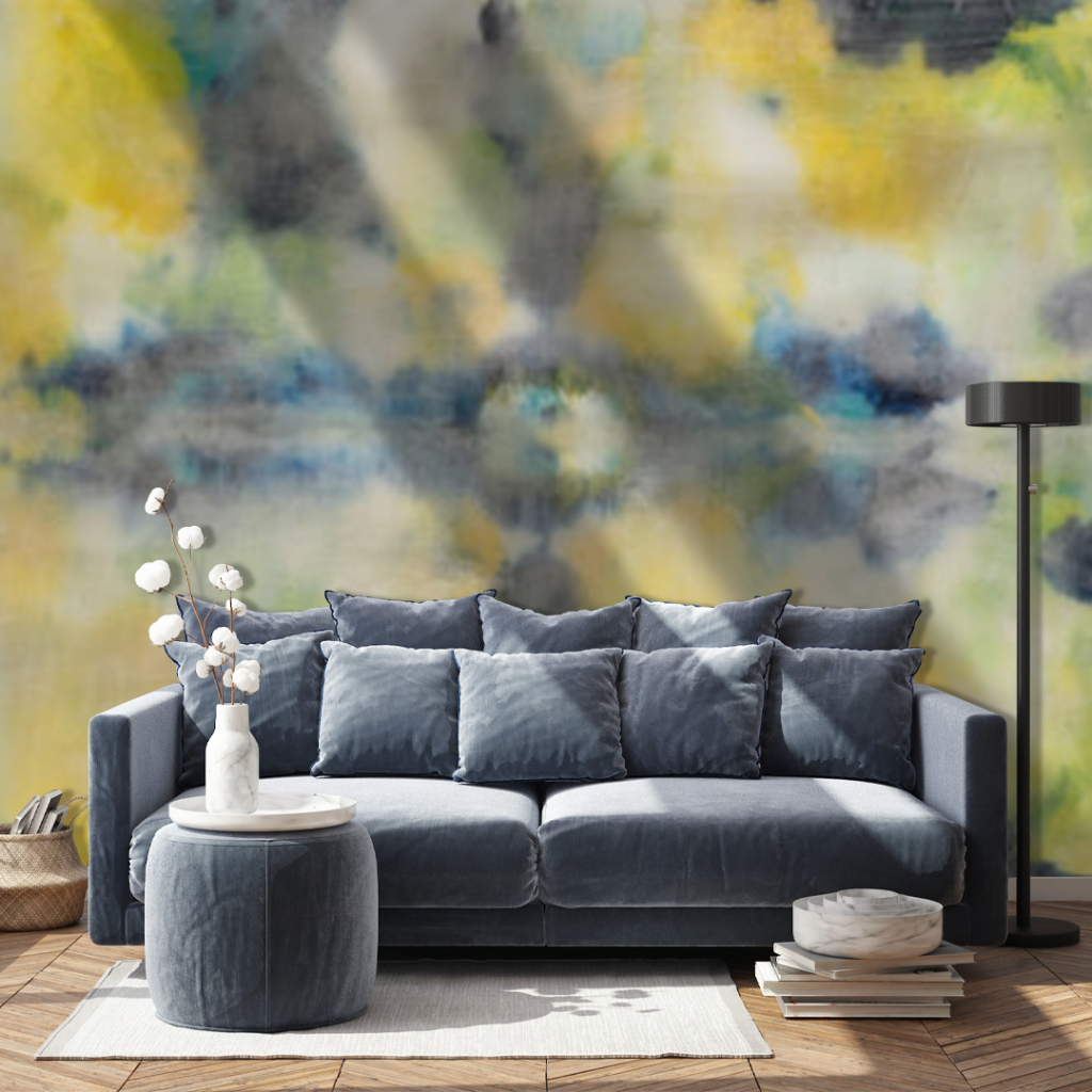
Catch Me If You Can Wallpaper:
This print will add warmth and mystery to your walls. This dramatic design has visual complexity making it so that something new catches your eye each time you glance at it. This design will easily add interest to the walls around your home or office. Give your interior that feeling of dependability and cheerfulness all at once.

Double Tulip Yellow Wallpaper:
This wallpaper takes a very soft and elegant approach using both yellow and grey.
The light colour palette of this print will open up an interior while the soft floral details bring drama and sophistication. This print is also adjustable in the way of petal sizing – large petals make a perfect statement wall or nursery while smaller petals could beautifully line the walls of a powder room.
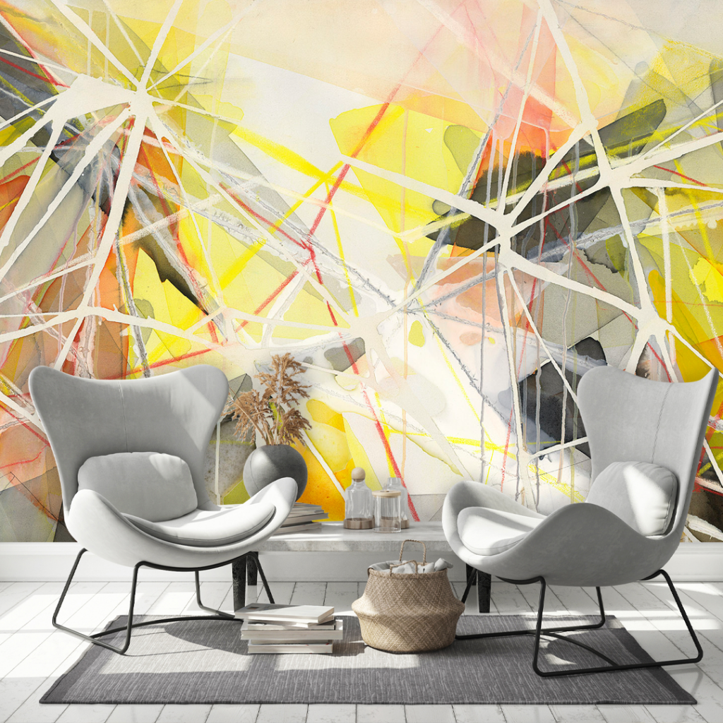
Light Copy Wallpaper:
This print by Lara Scolari is a more wacky and abstract approach to the usual yellow and grey combinations. Light Copy Wallpaper is jam-packed with vibrance and energy that will bring your walls to life. The abstract nature of this wallpaper means it can be used to style a variety of different interiors, including (but not limited to); a bedroom, teens room or even as a feature wall. Championing both of the Pantone colours, this design is sure to add vibrance to your walls.

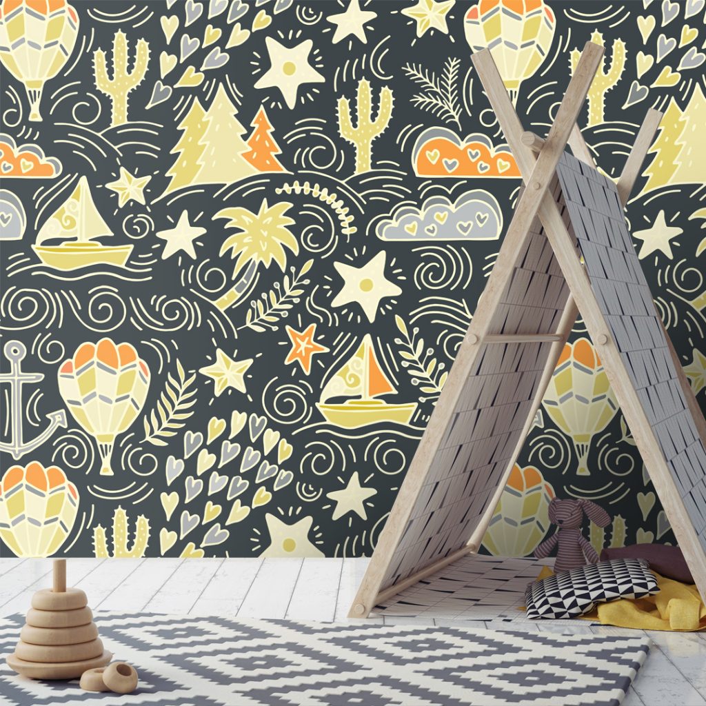
Time To Explore Wallpaper:
This print is for the younger ones out there who have a great imagination. The wallpaper showcases many cool features in both yellow/orange and grey tones on a darker charcoal grey background. The interest created by looking at this print will spark a child’s imagination whilst the colour palette will largely benefit your child’s room being the colours of positivity and dependability for 2021.

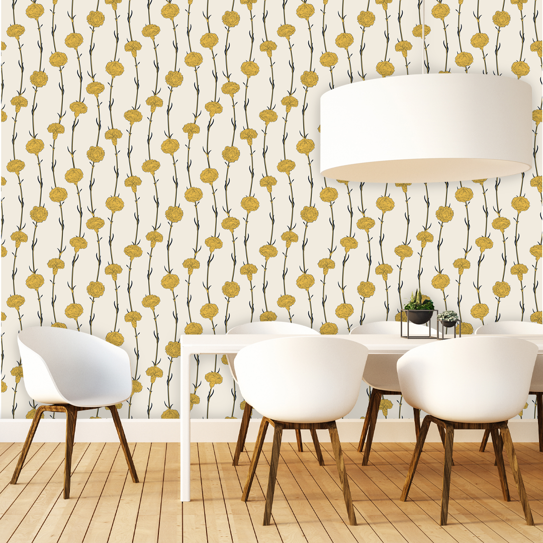
Vintage Cloves Print Wallpaper:
This wallpaper works ideally paired with block colour furnishings and doesn’t necessarily have to be just limited to one wall due to its old world charm element it creates in just about any space. This print features yellow flower buds with grey stalks and a very light shade of yellow for the background. This design is a fantastic choice for your powder room, kitchen or even living room.

Get inspired by our wallpapers here.